How Do Haplotype Differences Appear to de Bruijn Assemblers ?
In the context of previous commentary on Compass graphs, we were thinking about how the de Bruijn graphs would treat haplotype differences.
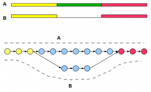
The best way to visualize de Bruijn graph structure is to start from the genome and draw the graph based on k-mers. The only difference with previous examples is that to account for haplotype difference, you need to draw two near-identical copies of the chromosome side-by-side and create a combined graph. In regions, where two chromosomes are identical, graph structures will merge. Where the chromosomes are different, you will see two branches of the graph as shown below. Circles in the graph represent k-mer nodes, arrows represent their connections, and dark shaded lines show read distribution. For simplicity, we have shown unidirectional arrows, but de Bruijn graphs of genomes are bidirectional accounting for two strands.
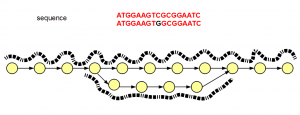
Interestingly, the graph structure for SNP shown above is not different from sequencing errors (shown below). The difference is in read distribution. In case of sequencing error, erroneous branch is less well- traveled by one or two reads, whereas SNP difference between two chromosomes will show near equal distribution of reads among the branches of the de Bruijn graph.
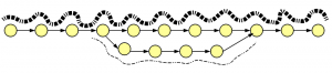
How about insertion-deletions? We borrowed an old figure on alternatively spliced genes, because graph structures for indels and alt-splices are similar.